Tablet support
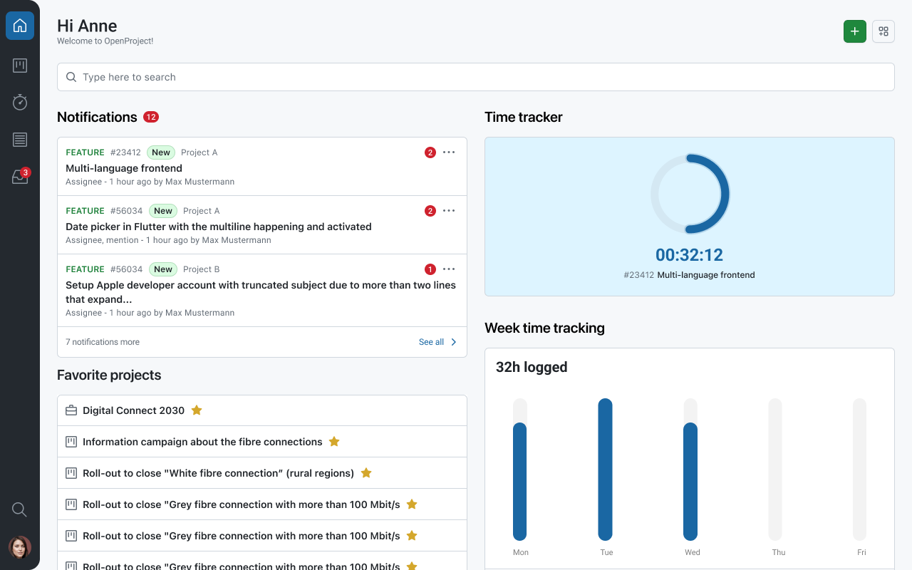
The OpenProject mobile app is designed for smartphones, but it is also optimized for tablet devices. On larger screens, the app uses an adaptive interface that takes advantage of the extra space to make navigation and review workflows more efficient.
Split-screen navigation
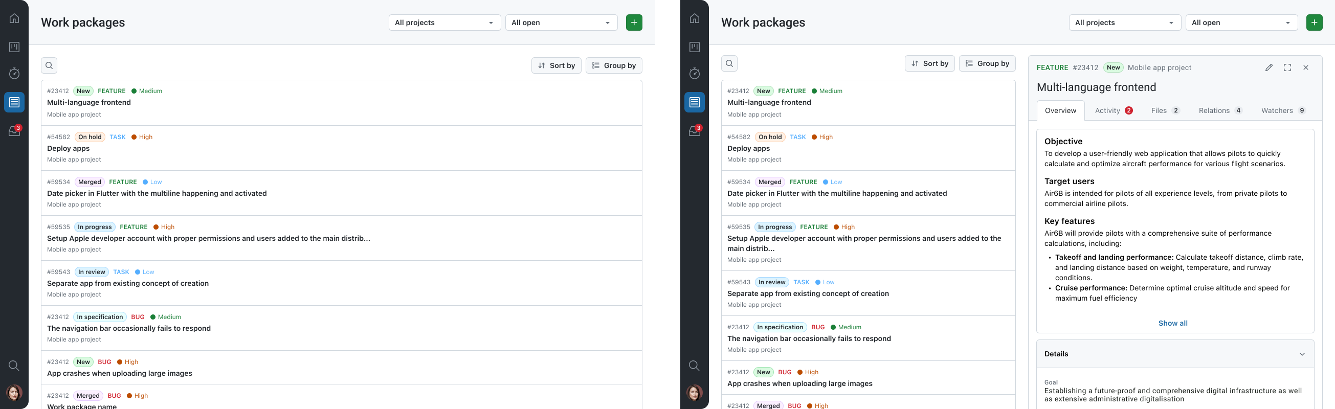
On tablets, the app uses a split-screen layout. This allows you to keep a list and a detail view visible at the same time, which reduces back-and-forth navigation.
With split-screen navigation, you can:
- Keep a list of spaces/projects or work packages visible on one side of the screen.
- Open the details of a selected space/project or work package on the other side.
- Move through items in the list while keeping the context visible.
- Quickly switch between work packages when reviewing or updating items in sequence.
This tablet layout provides a navigation experience that is closer to the desktop version, while remaining fully optimized for touch interaction.
Notes
- The exact layout can vary depending on your device, screen size, and orientation.
- Some UI details may differ slightly between iOS and Android, but the split-screen concept remains the same.